
Team: 1
1. Brief
Task: Design KYC form
Difficulty: 3/5
Time: 4.5 hours
In this task I had to design a Know Your Customer form to check if users were in the Politically Exposed Persons (PEPs) list. In my vision, it is something that real life banks can use when someone is applying for a loan. For that purpose I “opened” my own bank and called it “Sparebanken Mykola”.
2. Challenge
Not having much spare time for this task, I had to use my “free” time to think it through: while walking my dog, working out in the gym, or having a nice pasta meal for dinner.
I don’t think it’s a difficult task per se, but with more time I would have far better options to play with the design, do research, and even do some SEO. By the way, price per click on loan-related keywords is damn high (for instance, boliglån has 8100 views per month, SEMrush keyword difficulty 40%, and CPC $6.93 as of September 27th 2022).
3. Process
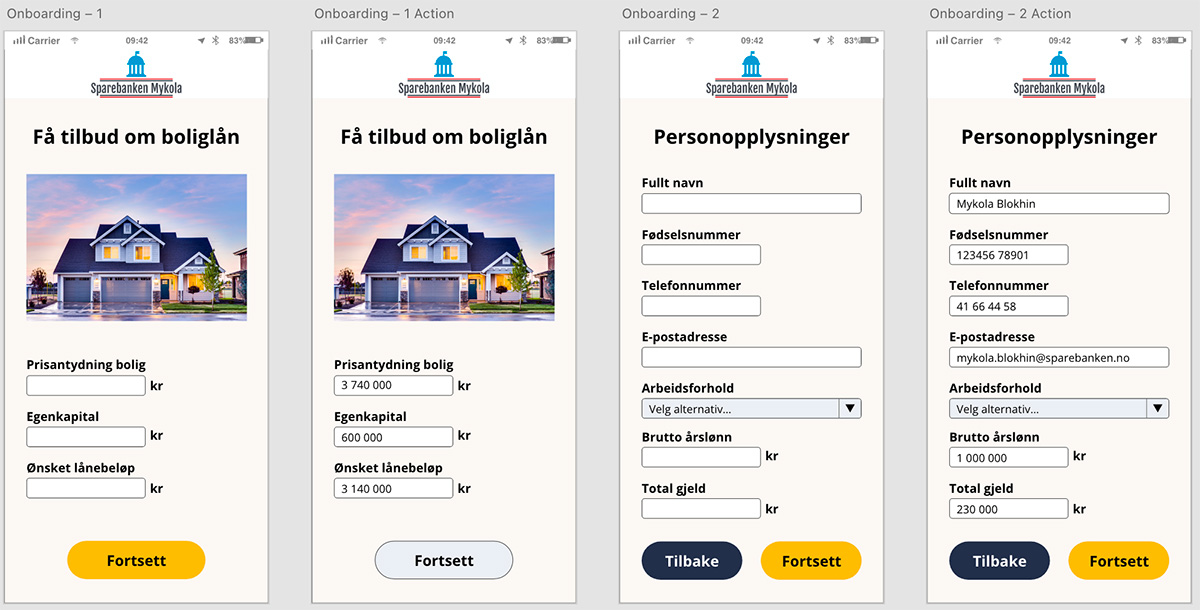
I decided to go with mobile-first approach and design for mobile app of a bank. Similar design could be used on a mobile version of the bank. For the desktop version different design would be needed.
I used Open Sans as a go-to font, which is free to use and is popular among web-designers. Do I have any real good reason to use this font? No. I just wanted a nice and easy to read font that looks simply good.
Solutions:
- All fields have enough spacing to avoid users “fat fingering” and clicking on the wrong part of the screen.
- I went with shorter fields for obviously shorter inputs like prices, phone number, national ID number etc.
- Did you know that buttons with rounded corners have higher CTR? Now you do. That’s the reason I made buttons rounded. The golden colour for “Fortsett” represents money, which customer will get in the end.
Solutions:
- I decided to keep the email field longer since I do know people with rather long emails, so I thought it would make sense.
- Button “Tilbake” has a different colour to visually separate 2 different buttons. Moreover, on click of “Tilbake” it would be good to have extra functionality with popup confirming the action. In that case accidental click will prevent of going to the previous screen. Saving already typed info can also contribute to mental wellbeing of everyone, who for some reason has to go back.
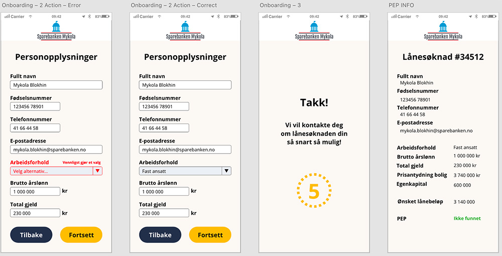
- Good old red colour helps visually identify field that was missed so users know what they should do
- After submission app will show Thank you message and redirects where it needs (main page of the site or app, for instance)
- The PEP INFO screen shows how the application can be seen be the bank’s employee. It has a recognisable and simple green PEP “Ikke funnet” for people not in the PEP base and ref “Funnet” for people in the base. Sucks for them.
4. Results
My solution was a mobile app with possibility to apply for a loan. Can the design be improved? Absolutely! There’s plenty of space for improvement in every single aspect that I touched.
The Adobe XD design can be downloaded from my Dropbox.
Simplified working version is added down below just because why not.

Få tilbud om boliglån